I suppot it, too.
All waypoints currently have the same shape (symbol) (i call it symbol A in this post). Symbol and color are features of different waypoint types (and/or stops). Nevertheless i take the post in the waypoint color topic.
But different colors are used. To this point additional notes.
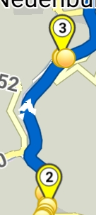
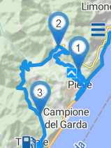
At the current type there are used different colors for via points in app and web. In app they are yellow, in website they are blue (see screenshots).
In the docu there is
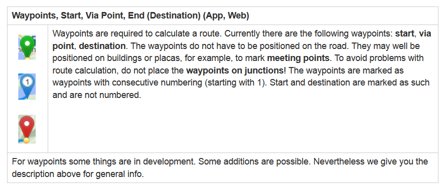
Currently we have 3 standard waypoints:
Start point (symbol A, green)
End point (symbol A, red)
Via point (symbol A, yellow in app, blue in website)
For future (announced in forum or beta):
Shaping points
When i remember correctly as color yellow was mentioned in the forum (above mentioned not be colored, how to recognize then?). I don’t know the symbol of the point.)
For future (proposals from users):
Different colors (and/or symbols) selectable from the user for different stops (Fuel, Eat/Drink, Parking, …).
To keep it simple not to mutch colors should be selectable. Due to the (in near time) available individual waypoint names we don’t need so much selectable (customized) colors.
The colors (and symbols) should be identically in app and website for the same type and stop.
Then you can avoid missunderstandings at the users. It is easier to keep some points identical in the docu.
The content above is posted in the App: waypoint colors too.