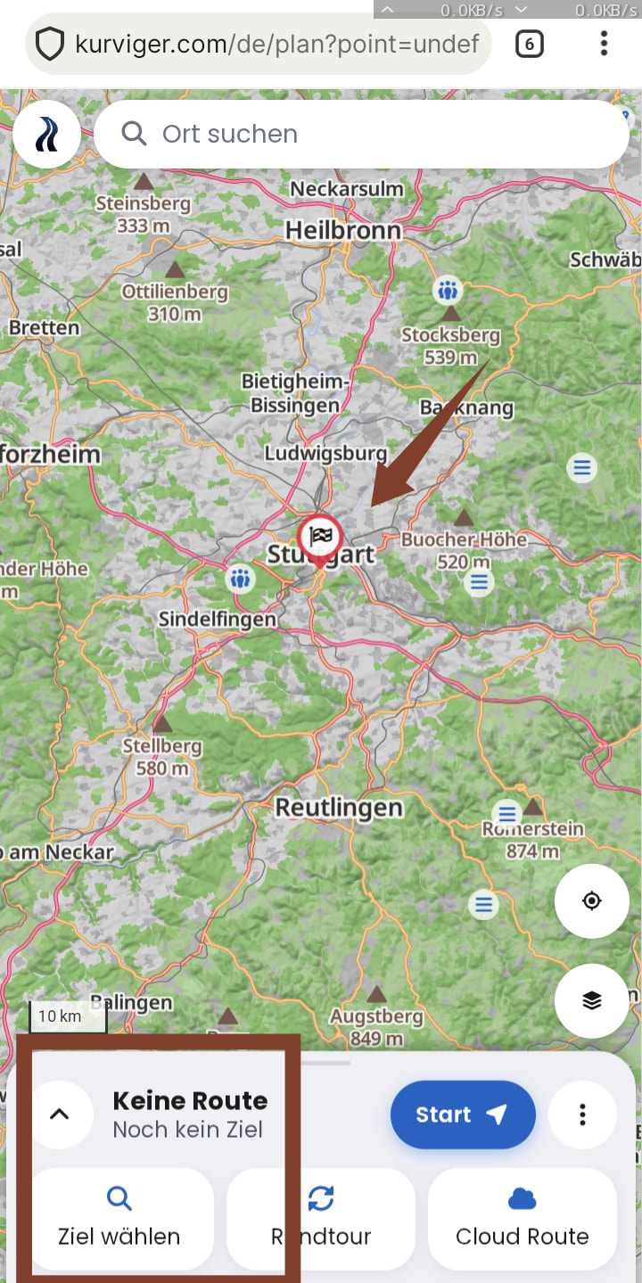
We’ve overhauled the route planning view. We have collected a lot of feedback and woven this together into a new and improved route planning experience. The update is live on the web now and will come to the apps with the next app update. Here’s what matters most:
A clearer waypoint list
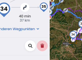
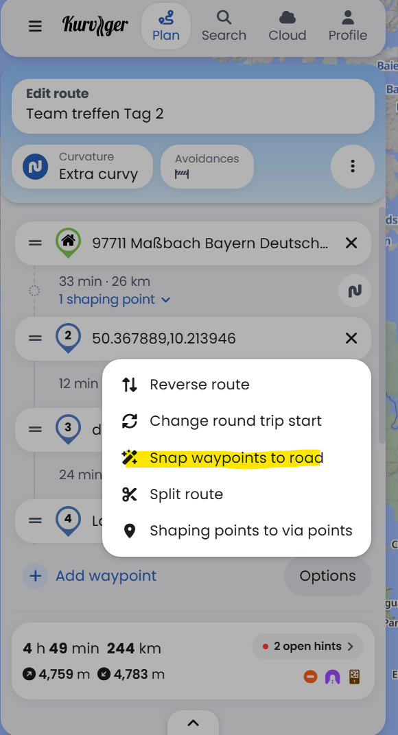
Each leg between stops shows its time and distance, and the icon on the right sets its curvature. Shaping points are folded away by default to keep the list tidy. Reverse and more actions are below the list.
Overview and Hints
Shows closures, tolls, unpaved sections, climbing and speed limits at a glance. Tap a card for details. Find possible issues along your route with ease and fix them quickly.
Everything in one sheet (mobile / apps)
Curvature, avoidances and your waypoints are now in one sheet within thumb’s reach at the bottom of the screen. Swipe it up for more about your route, split into three tabs: Overview, Waypoints and Hints.
Improved dark map
Our dark map was revamped and is now a lot more helpful when planning a route and easier on the eyes when navigating.
I have only summarized the bigger visual changes. There are a lot of new details to discover .
You can test straight away on our website: https://kurviger.com/
As always, we’d love to hear your feedback here in the forum. Happy planning!
But can I complain again that the undo and redo buttons are still impractical and therefore barely usable?
Can we hope that they’ll be added to the user interface soon? That is IMO important
Congratulations, thanks for belonging to the small little rest of people that use their brains to develop and improve even a nearly perfect product. Since it sounds like German-speaking developers, I will stick to my native language.
I find what is happening here reassuring and exemplary. Brains and intellect are being used to make something good even better.
Why am I emphasizing this? I firmly believe that the vast majority of our children’s and teenagers’ abilities are being systematically dumbed down and “standardized” in a friendly way by the internet, social media, and increasingly by AI. They are being transformed from sponsored, even dumber influencers (a bunch of wannabes) into mindless, consuming followers.
So much for the preamble.
Regarding the product: I’ve known this routing tool from its beginnings on the PC up to almost the newest version. Super clean developer work, a well-thought-out, well-field-tested user interface. No useless bells and whistles. And open import and export functions rather than being castrated for customer retention. Even though Google Maps is clearly superior in the up-to-dateness of traffic situations, especially in major cities, this is and remains the better, much better tool for motorcyclists like me.
I think that Kurviger will continue to grow through word of mouth.
It is worth every cent.
Thanks to the designers, implementers, system architects, and testers.
Many, many thanks to the entire development team for continuing to make Kurviger a fantastic product! Is it perfect? Of course not, but it’s getting better all the time.
Unfortunately, my riding days are over until some time in the middle of next year due to a broken foot. I broke it three months ago and the fracture I have is one that takes a very long time to heal properly. Add to that the fact that I ride a 1,000 lb. Goldwing and suddenly I am unable to rider until it is completely healed and I do some strengthening exercises. Such is life.
I’m excited to try it out come next year’s riding season! For the rest of you who are able to ride, ride safely and be sure to share your experiences concerning these new features. Nothing beats real-world experience from riders who use it!
I’ve only tested it briefly on my smartphone and in my browser. It really does make you smile. A customisable overview page, where errors can be fixed (semi-)automatically at the touch of a button.
In Section where you select quickest Route it is still not possible to take highway only for this part if before toll roads omit was chosen for all the rest of this route.
So if you want to come quick to a point you always have to splitt the way , not possible within one route.
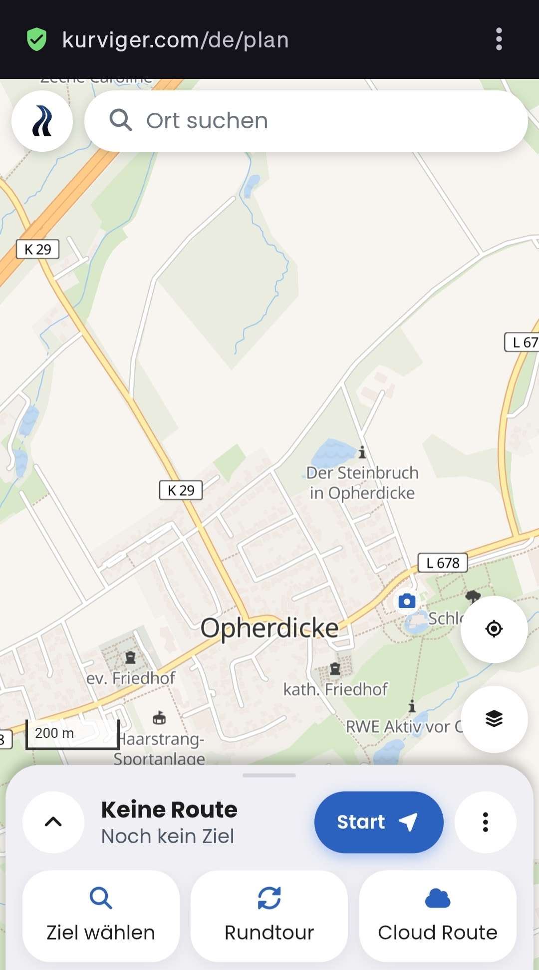
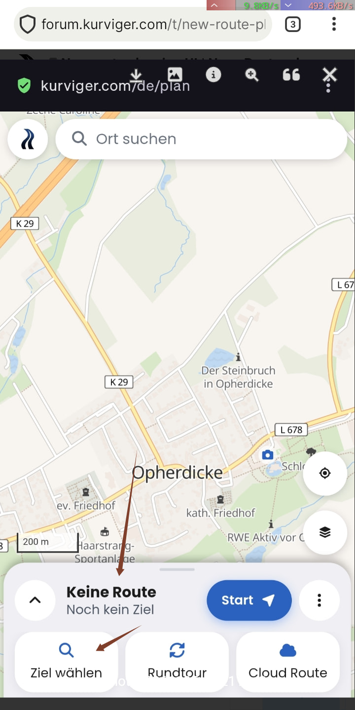
@Kira The second option is inconsistent; for example, if I set the destination via option 1, the starting point is missing to complete a route. The info No route - no destination yet - choose destination is incorrect.
The IMHO part..
I almost suspect @Ilias is confused because he’s looking for the Start point? Complete understanding, because I felt the exact same way.
The “two-field solution” for start and destination was more obvious. Especially since I have to work at the top to set the start, and at the top or bottom to set the destination.
Deeply embarrassing confession: Reminds me of my first Kurviger 2, where that pretty much was the hurdle for beginners! Head and fingers just want to enter a familiar start and destination, but to do that, I have to search. Huh? Why search instead of typing? Ultimately the same result, and yet completely different. I look - see two fields - I understand - type.
This is about the web version, which is typically used on a computer, and everything there is just as it was before.
You mean how the web version looks on a smartphone, and it would be important to mention that detail. It’s really unfortunate there, but not necessarily the typical use case, since that’s what the app is for. Still, the responsive design should be clearer, or the deviations should be documented.
Something small in Touch mode, doesn’t seem to be limited to smartphones.
Delete route - back to start
Create new round trip
Close dialog
Slider up > Waypoint list
Bottom New waypoint
Unexpected: Round trip dialog opens
Even when I then create a new route via 3-dots > New route (i.e. not a round trip), select start and destination, and add a point via the waypoint list, the round trip dialog appears. Only after clearing local data is it good again.
Thank you for your feedback . It’s great to hear that you like the new version
The logic here is that on a smartphone you are usually already at the starting point, so you actually want to go somewhere. If you compare it to other navigation apps like Google Maps, the same logic applies here.
You can still plan any start and destination you like via the search and by tapping the map. What you no longer see is an empty waypoint list.
Have you been planning in such a way that you tapped into the start field and then searched? Then not much really changes, you just have to go into the search field, type there, and then select it as the start?
Yes exactly, in the app it will look just like it does in the browser on kurviger.com on your smartphone. So if you notice anything here, please let us know so we can take a look before the app release.
I usually set my start point first and also via favorites because then I see the name in the waypoint list and not an anonymous coordinate. It could also be the vacation planning from the hotel, which is the starting point for various round trips.
Yes, I understood the thought and in the end I have a route. Definitely doable for me, probably also a matter of getting used to it. I think it’s harder for beginners.
 .


 Could you please describe in more detail what is confusing you right now?

 . It’s great to hear that you like the new version