Hello.
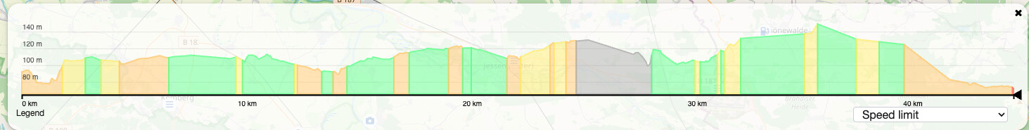
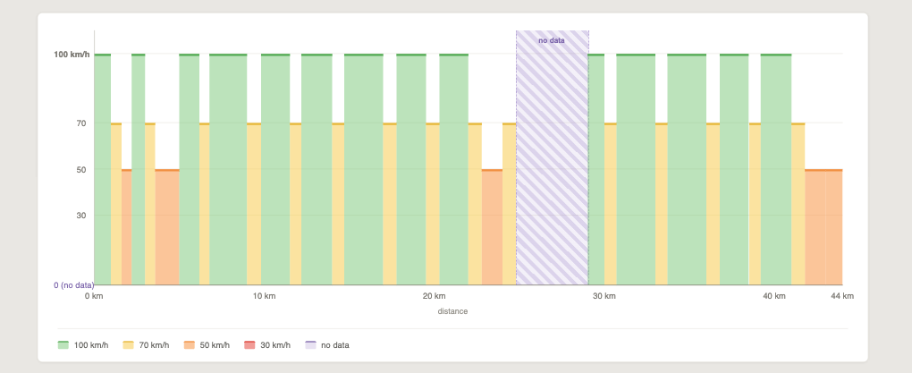
I have a suggestion on how to represent the speed limit graph better. Currently, the chart maps speed limit onto color over an elevation profile, so you have to mentally decode the color key while the line height tells nothing relevant. Putting speed limit directly on the Y-axis turns it into a step chart which can be easily read. Compare the current
with the suggested:
Also, it would be nice to be able to compare speeds when all curvy modes are displayed, like this:
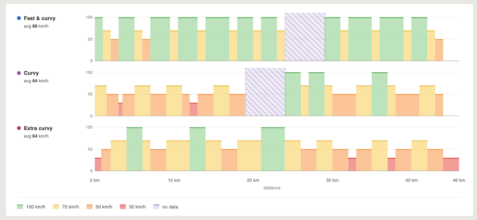
Gives a much better idea of what to expect in my opinion.
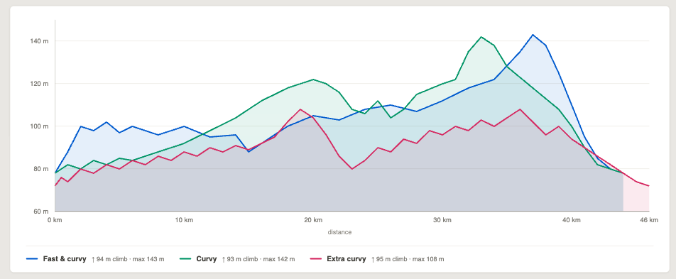
And the last one. For some, it may be useful to compare different elevations for different route types, so displaying them all on one graph may be beneficial:
What do you think?
Cheers.