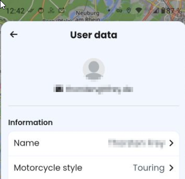
Today we have at the top the username. A tap on the user opens the menu User data.
My motivation is
- to reduce things, so the user can concentrate on other stuff
- Shorten the menu to have easier access to other items
- Shorten the menu in general
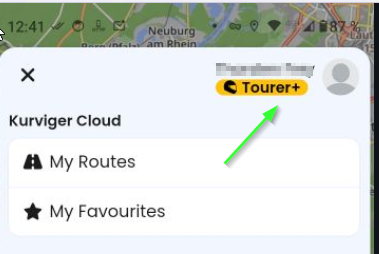
Menu opens:
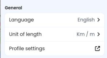
Additionally we have in the settings a block General, which is - from my point - obsolete and can be removed, if these settings are put into the “User data”.
–
Settings - General - Language
I have tried with two users. User #1 set to DE and User #2 to EN.
When logging into the app with the two users, the language of the app was the language which was set here. For example setting EN - the language did not change.
Correct would be at this point the naming *App-language" instead of just “Language”.
In real life, it makes in 99,9% no difference, as only one user uses the installation.
Nevertheless my proposal: Please make also the language user-dependant.
- Save the language in the user profile
- When logging into the app, check the langugage of the user and change, if required
- Remove this setting *Language" from the *Settings"-menu
- Add Language to the user menu
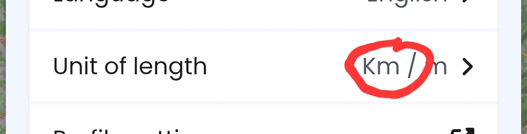
Settings - General - Unit of length
I have tried with two users. User #1 set to km and User #2 to miles.
Already today - when logging into the app - the unit for the user is used.
Proposal:
- Remove Unit of length from the *Settings"-menu
- Add this Unit of length to the user menu
Settings - General - Profile settings
This option opens the same menu User data as if i tap on my user at the top. It is redundant.
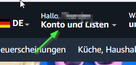
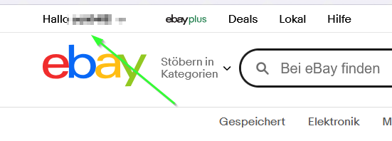
Tapping on the user seems to me a common way to access user data. I guess, that even users with little knowledge and training will find this. Most of the users will have some experience with shops, banking- or insurance-sites, where the user data is accessible by some user-releated hint at the top.
Amazon:
Ebay:
Proposal:
- Remove this (redundant) item
Finally the section "General* can be removed.
In doubt, the user will recognize the user-data at the top, an icon could be added (3-dots or a gear).