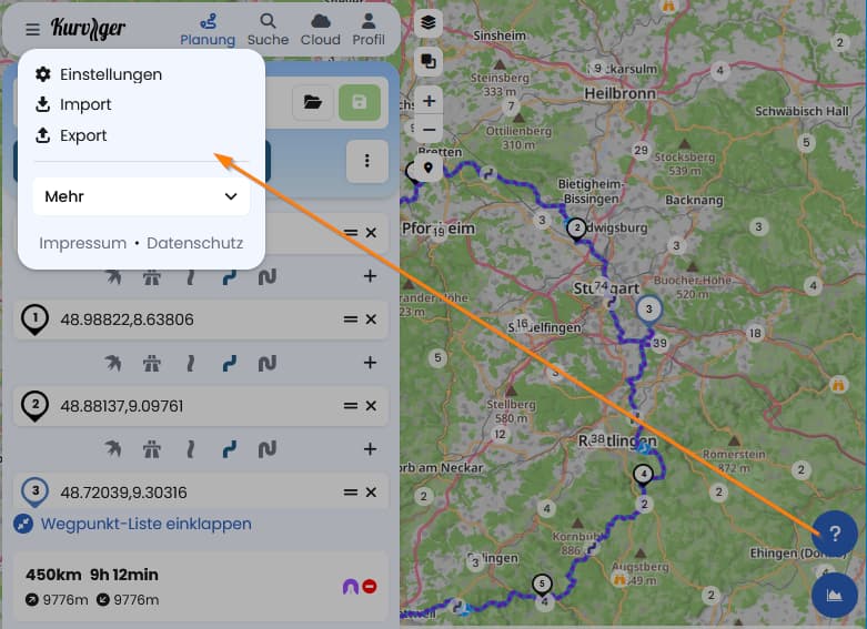
I am more planning in the app as in the web. This let me search the help center first in the menu. Then I remember that it is in the right lower corner. Ok, it is in first place my stupidity.
Suggestion:
As the menu is quite short the help center could be added to the menu.
The menu would be more consistent with the app version.
The button should be removed from the map. I may be wrong, but I consider the help button not so important, to be placed this prominent. Choosing the help in the menu would be just one click more in favor of a cleaner map.
I think if somebody is having trouble, it should be as easy as possible to get support, and a button on the map is one of the most visible place. On mobile we don’t have enough map space, so we moved it into the menu.
We could maybe add it to the menu as well, which would lead to a duplicate - which is also not great