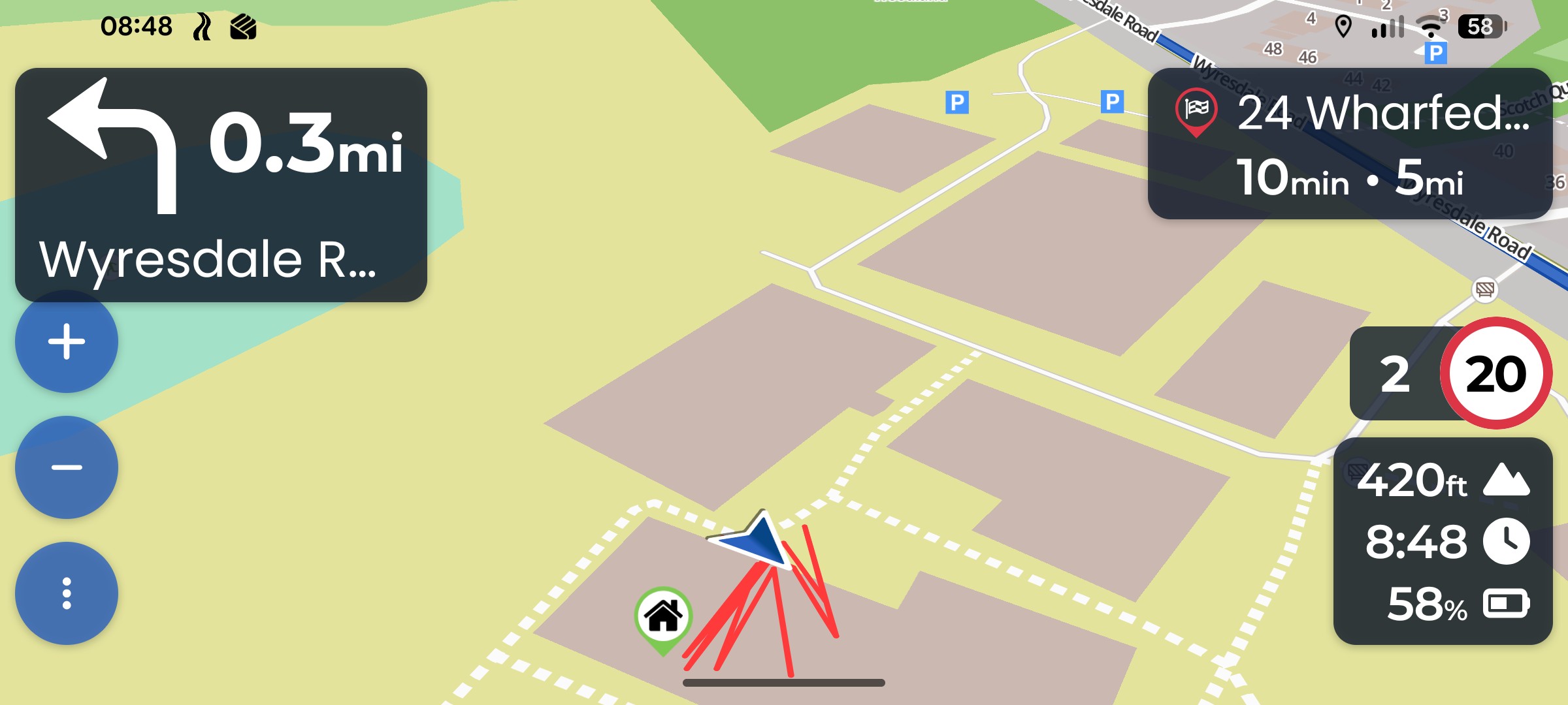
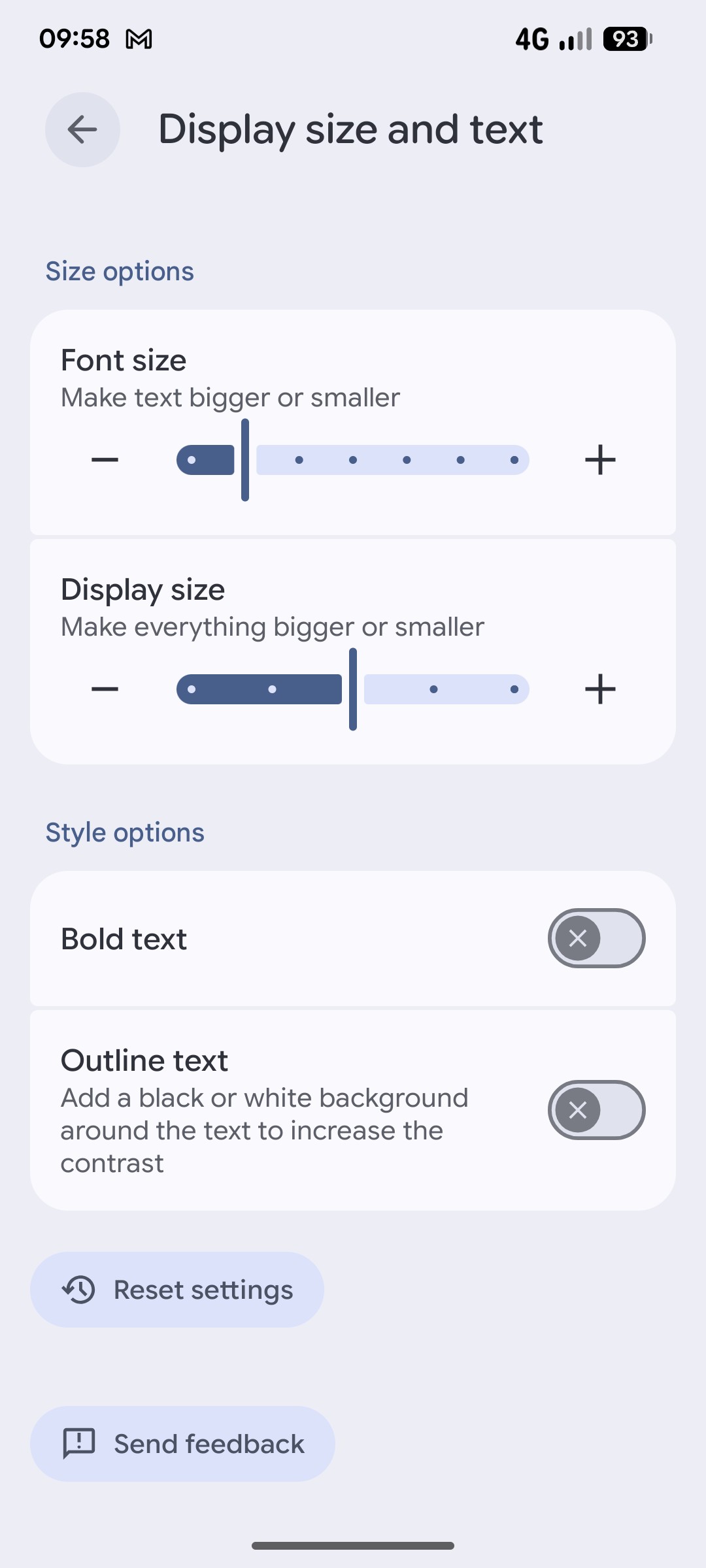
Here are the screenshots from my phone. I forgot to mention it was it was in landscape mode that the problem arises with the overlap of the icons. If I
lower my Display size the icon doesn’t overlap anymore but this affects everything else on my phone including the display size of the text in the navigation.
The ‘+’ icon also sit exactly on the front camera lens too.
I do not understand this quote about the three dots not being used in Android. I do have them and need them to exit the navigation?
I would say that moving the icons slightly to the right would not be a problem for the map as the focus of the navigation is mainly ahead and not to the far left or right in landscape mode.
Or possibly move the three dots to the right and move the + & - down to the bottom corner? Just an idea.
Sorry, my bad, I mean the 3 buttons. In Android you can choose between the 3 buttons and the newer gesture navigation, where you only have the bar one bar at the bottom.
In Landscape these 3 buttons are on the side, and not at the bottom.