Perhaps we may here gather some ideas for enhancements for the “Navigation - Next turn instruction” menu?
Proposal 1: Currently chosen option for curvyness + lenght of total route + time of total route
Sometimes while following navigation I get uncertain, wether I really had chosen before the right curvyness option. A tap on the “Next turn menu” could show (and so confirm) it?
Perhaps together with “length + time of total route”, as it is shown for example after creating a route?
I absolutely agree with that: this dialog should be kept simple and not be overloaded. Detailed informations / options should be handled by using the regular menus.
Hmm, I am not 100% convinced.
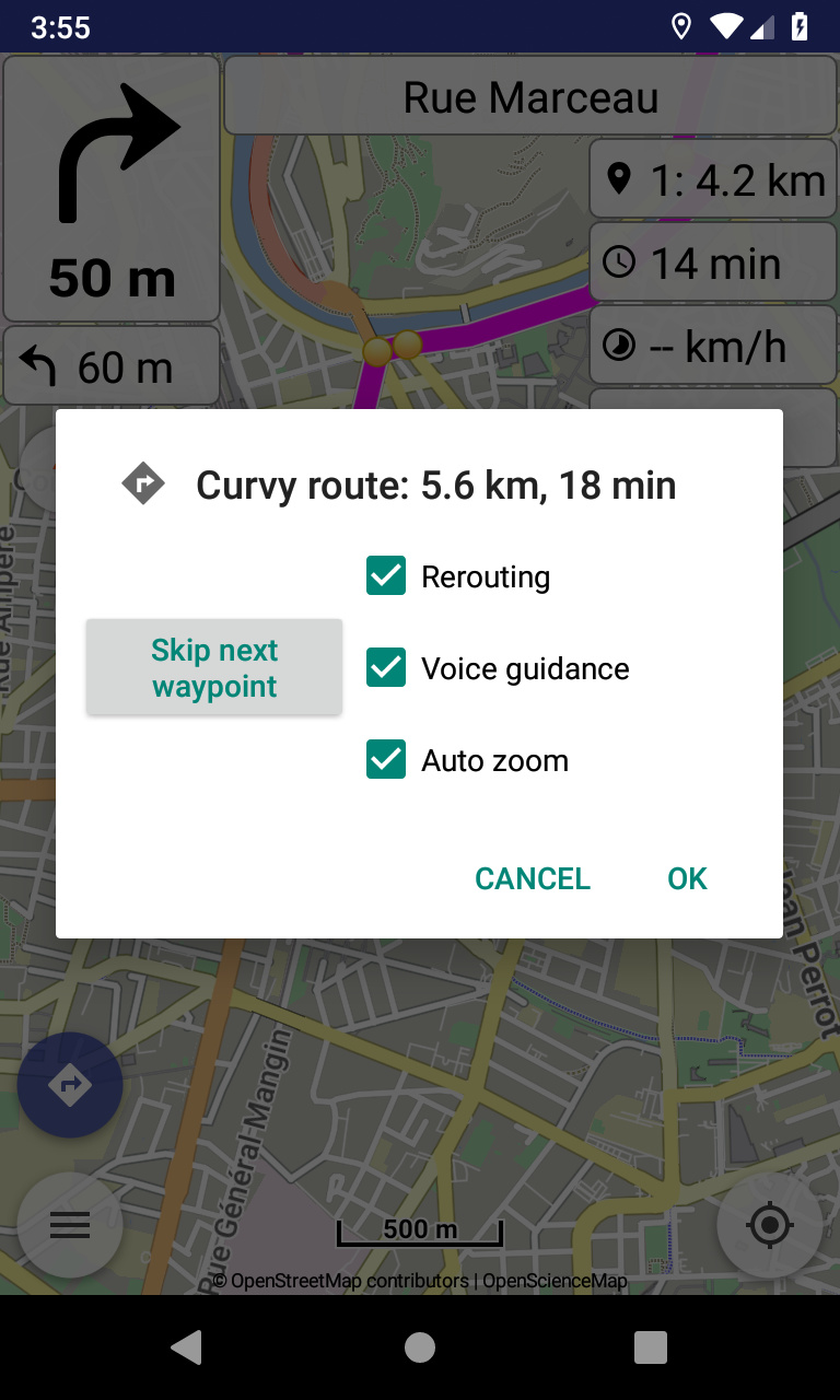
Think, you have to operate this menu with gloves. Skip next waypoint causes immediate action, so you don’t want to touch that accidentally.
IMHO the check boxes are to close to the Skip next waypoint action button.
BTW
Is Skip next waypoint more important than the other actions.
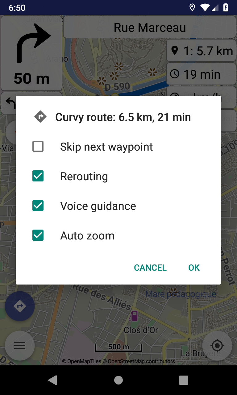
What if skip next waypoint would be a check box as well, which would be cleared after pressing OK?
What do others think?
That’s was exactly my initial idea and implementation! A list of equal check boxes where everybody can check whatever wishes. “Skip” is just one of them, cleared each time.
Indeed an option should not be more prominent than others, as everyone has different needs and preferences.
If you mean an extra button below, with ok / cancel, that’s not optimal:
Dialog buttons should have minimal text, “Skip next waypoint” is very large text.
In future will have more actions, cannot have buttons for each in dialog buttons.
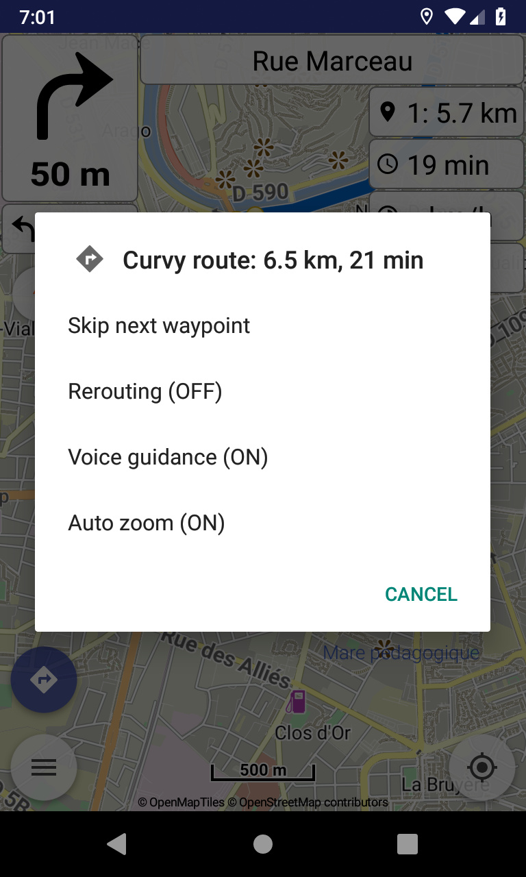
I suggest differentiating what I would call “Actions” such as Skip next waypoint from “Options” such as Rerouting. This could be done by using quite large icons for “Actions” and text for “Options” as at present. Since one cannot use the screen for anything else while this dialogue is showing, the dialogue could be made larger if need be.
I would like to see an additional “Action” for cancelling the route - “clearing” in Kurviger terminology - on this dialogue screen.
This menu is meant more for navigation tasks, to be done efficiently while navigation continues.
What is the purpose for clear route (i.e. stop navigation) and not use the current available ways?
It is marginally quicker for one and would also be consistent with the interface in Locus Map Pro which is the other navigation app I use. I do appreciate that this is not necessarily a factor in your thinking however!