I have a problem using the apps in landscape mode.
when I’m in this landscape mode, informations about via point are not readable enough, I explain :
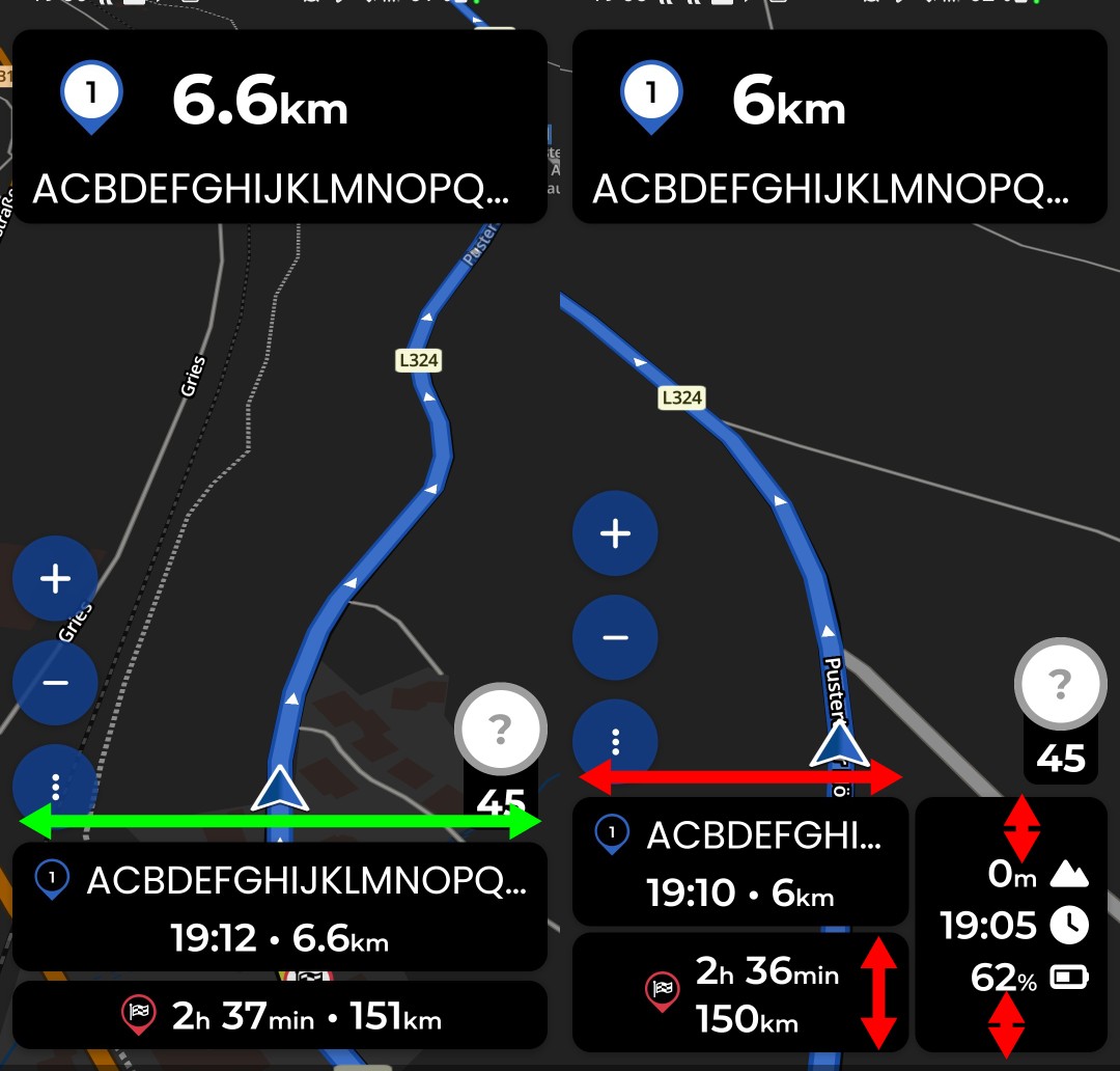
In portrait mode the informations create (for example : stop fuel) are readable, but in landscape mode the window is too small and the entire text is not visible.
In landscape mode you can swipe to scroll the widget with the gas station up to make the ‘add to route’ button visible. If I missed your point please describe a bit more in detail the issue.
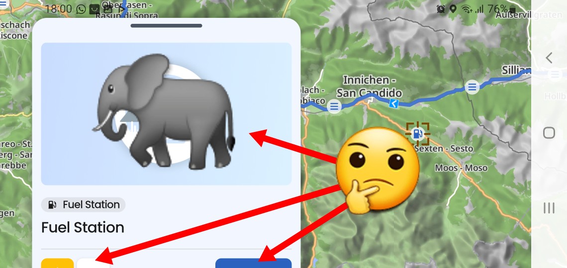
If it is about this window, then it is big enough, just the contents are inappropriately prioritized. Showing a placeholder image with no information and function and not being able to see useful buttons is suboptimal at best:
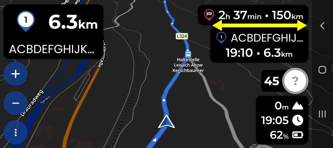
In portrait the name is displayed over the whole width of the display. In landscape the width of the text is limited to the width of the info boxes in right upper corner and ends up in short text with points “My fav…”.
You cannot, but you can express your opinion about it and see if developers could make some improvements.
The info-box in the upper right corner is a new solution and opinions like yours help developers in evaluating user acceptance.
I personally would not like to have the info box at the upper right corner at all - IMO it obstructs the view on the map and the route. I would definitely not advocate making it bigger. I would be in favour of “all info-boxes on the left side” layout, like it is on Android Auto or Carplay. But that’s just my opinion and there are other views. Finding a good compromise is not always the easiest task.
Hmm. A friend (yes, not me!) saw the design with black boxes, I switched for him to light transparent boxes.
The conversation was interesting.
“Better?”
“Yes!”
“You still look unhappy?”
"“Yes, please hide it completely!”
“Why?”
“I am driving most of the time roundtrips and I know, that it takes 4 hours, and I know that in 2 hours I have lunch at a certain point. Why must I see it at all or all the time?”
“It is important. There are people complaining even when the arrival time is not exaxt to 5 or 10 minutes.”
“Really? This is not my understanding of driving a motorcycle.”
My thoughts were ..
click to switch from time to duration
second click toggle back to time
third click to maximize to possible or required size to see most of the waypoint name (in case there is a waypoint name at all)
fourth click to minimize to a still clickable area
Thanks for the “second hand feedback” @Toffel. Noted!
Those are things we already discussed at some point in the past… In my opinion, the other clicks would just complicate the function of the first two again. If the box really is too small or too big, we should find a more permanent solution to the problem.
We take this kind of feedback seriously @fafi64. But so far, it seems that the majority of users aren’t particularly bothered by it. We’ll keep an eye on it
Hi Kira,
just to be more clear I send a drawing which explain the item.
I would like also to thanks all people who have answered my Item.
Take pleasure on road pb affichage galaxy tab3.pdf (297.5 KB)
An other possibility could be having access to the police character parameter dimension in order to be able to manage the size of the police character.
Thanks a lot for your help.