ich weiß es gab nen Beitrag dazu , find ihn aber grad nicht
zur UI und ggf Wünschenswerten Änderungen
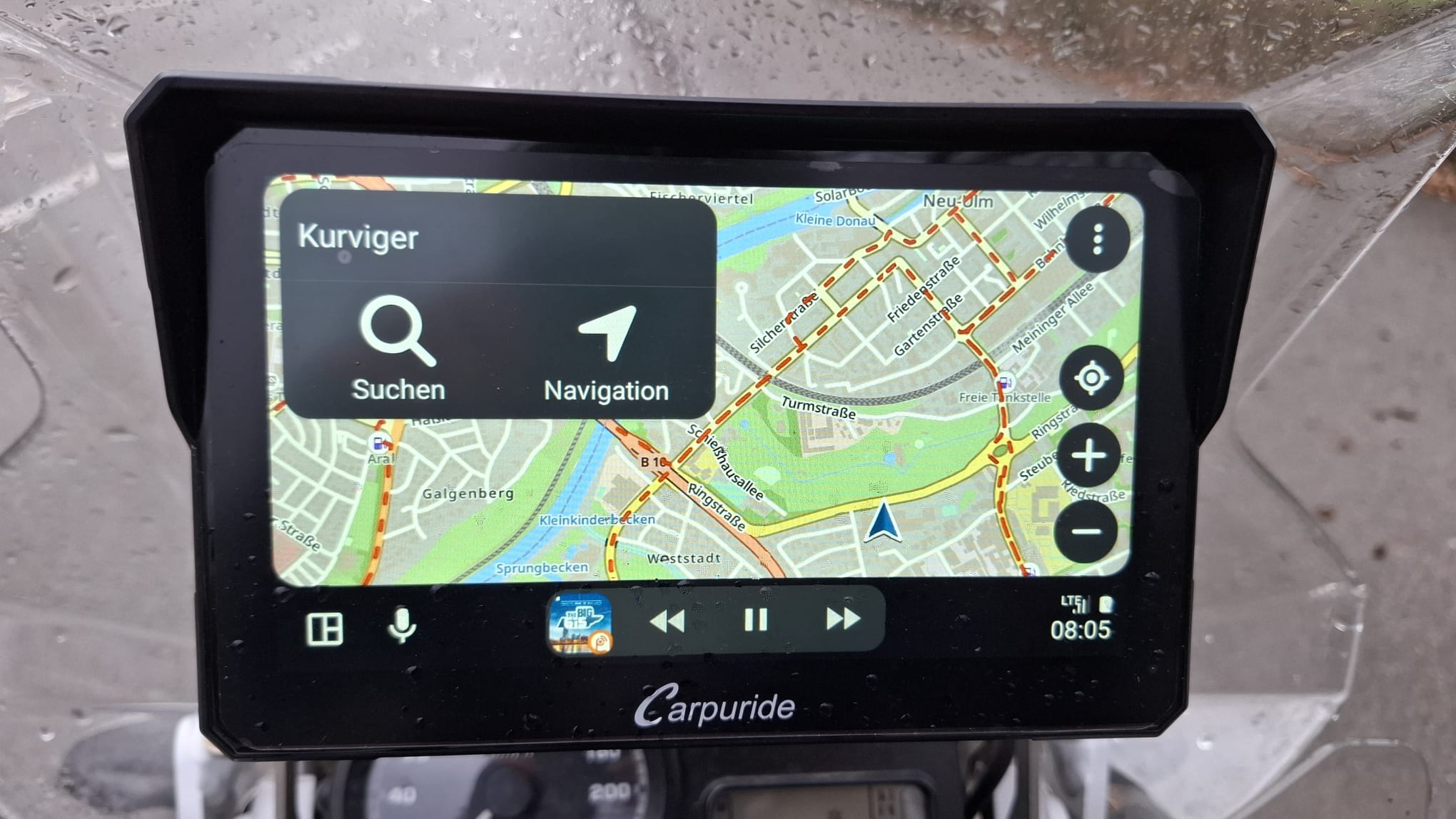
in , hoffe ich lieg jetzt richtig" Follower Modus" also wenn ich die Karte ohne Route nur mitlaufen lasse , was immer bei mir der Fall ist im Carplay.
wird in Kurviger diese große Auswahlfeld li Oben Suche und Navi angezeigt und ich kann das auch nicht wegklicken es nimmt 1/4 des Bildschirms unnötiger weise ein anbei gegenüberstellung Waze da wird das feld automatisch nach ein paar sekunden ausgeblendet und duch klicken wieder aktiviert
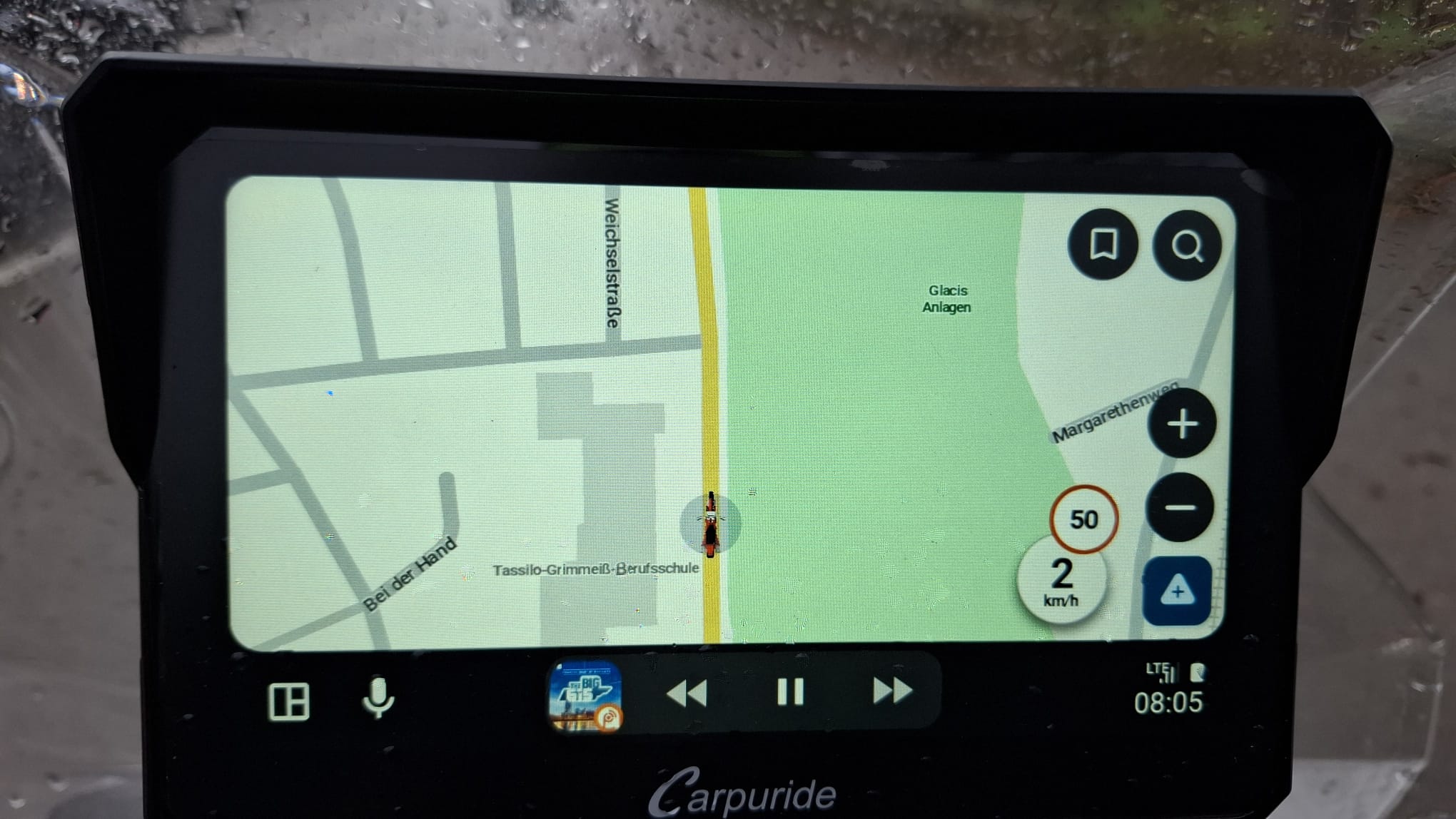
im Selben Modus Waze erlaubte und gefahrene Geschwindigkeit möglich , warum bei Kurfiger nicht ? war auch in einen Fred irgendwo.
BTW, “Follow mode” is in Kurviger a special mode which you can access only if there is no route loaded - it will appear where the “Navigation” button is. Quite inconvinent that one has to delete the route to access this mode, but that is how it works now.
Danke für den Link , dann ist das ja schon angesprochen,
wobei mir technisch nicht klar ist warum welche Dinge bei anderen “einfach” gehen
komm aber aus ner anderen Ecke und hab mich noch nie mit App und AA Programmierung beschäftigt.
mhhh if i got it right , will test later this days.
thx
hope for AA16.1 and an change, its like someone say p.i.t.a.
Nein, tatsächlich ist der Follow Mode nicht die Startansicht wie auf deinen Fotos zu sehen, sondern ein eigener Modus für genau diesen Zweck, also die “Karte mitlaufen zu lassen”. Wenn du keine Route lädst, kannst du hier einfach auf “Follow” klicken und dann ist auch kein Element im Weg.
In fact there are limitations in this dev environment that we can’t change. We can’t change the size of the element or hide it.
@Andy2 Danke für das Feedback, aber ja genau, diese Kritik ist uns bereits bekannt.
Kleine Anmerkung zu waze: das ist eine Google Software und für die gelten da leider andere Regeln als für uns.
But you can choose smaller elements, as (also) already discussed :
There is simply no need for such big buttons/elements - users are supposed to use smaller buttons like zoom and menu much more frequently and on the smartphone you also initially use smaller button on the map to start the navigation.
So, why would it be important in this specific case to have them bigger?
From my point of view I’d rather ask the question why we would have them smaller in this view. It’s a start screen where you have the options to either search or enter the navigation/follow mode. So the main actions for this screen are in the spotlight.
In the app, it is the “planning view” that is optimized to do planning actions.