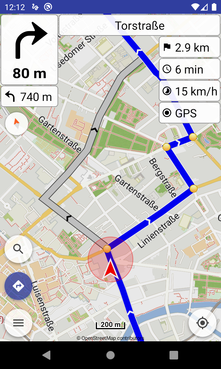
The app does a great job of following a route, and rejoining it after a deviation. Sometimes a route will intersect itself (e.g. https://kurv.gr/3RzMv), and the only way to know which route to follow, when the paths diverge again, is to look at the arrow and distance at the top of the screen. Sorry, I don’t have a screen capture.
One way to make this clear on the map would be to un-focus the part of the route that is not current, either by blurring it or making it a lighter shade of blue. Another way would be to add arrows into and out of a convergence of the route for the current section.
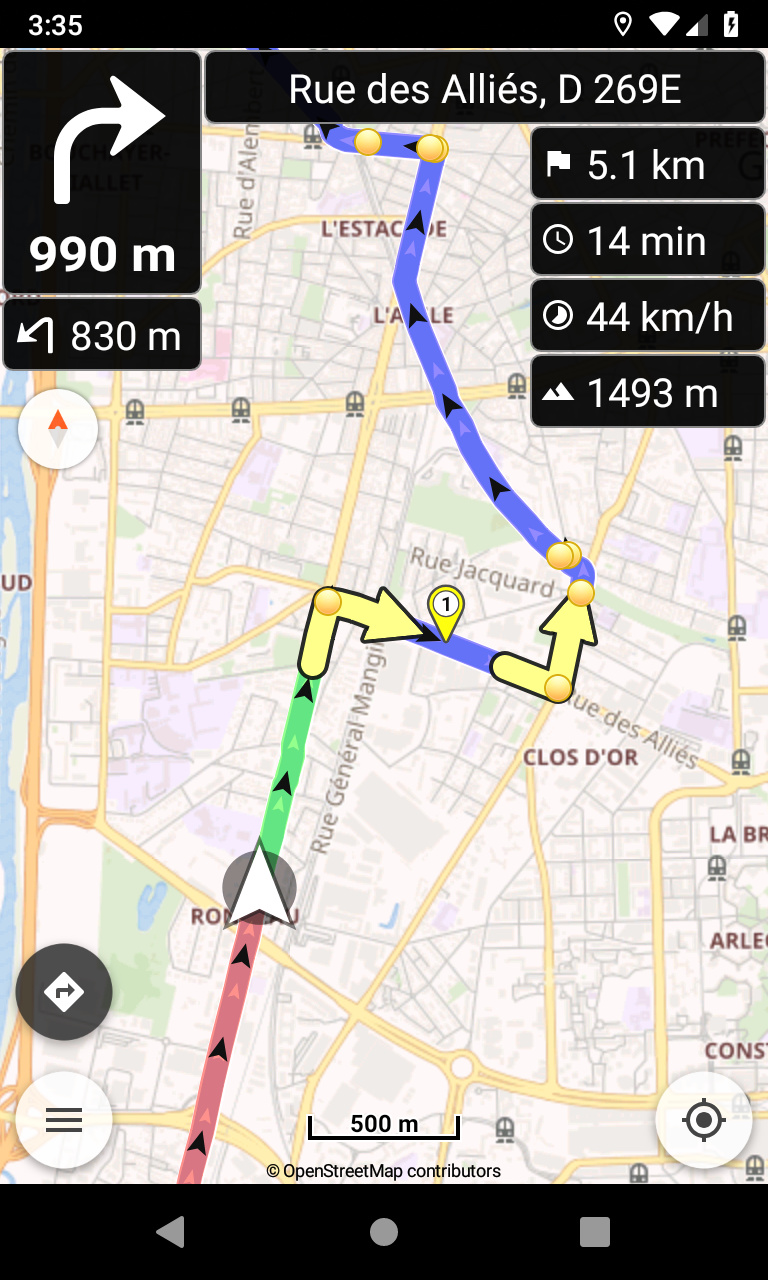
Hm sorry to be the only voice of dissent here but that screenshot looks a bit… colorful. Bit overkill I would say. I could really live with only the arrows and maybe a lighter shade of blue like Google Maps does for example, like @alwynallan suggested in the OP
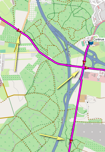
Ich habe gestern beim Abfahren einer Route ebenfalls Richtungspfeile vermisst. Vor allem, wenn man ohne Waypoints arbeitet, etwa bei einem Track, kann man sich fragen, wie die Route denn nun weiter verläuft, vor allem bei sich kreuzenden Routen. Allerdings sollten die Pfeile erheblich weniger sein, als auf dem Bild oben. So wie bei Basecamp reicht es vollkommen, siehe Bild.
Yesterday, when I was driving a route, I also missed directional arrows. Above all, if you work without waypoints, such as on a track, you can ask yourself, how the route continues now, especially in intersecting routes. However, the arrows should be considerably less than in the picture above. As with Basecamp it is enough, see picture.
I prefer arrows. Much quicker and clearer to recognize. Pikes easily look like dots (without direction) when having a quick glance on the display while riding a bike (they even could be a little bit bigger).
The latest Beta display is a big improvement. I have a few suggestions
The direction arrows should be fixed on a line segment. While I ride the arrows move backwards, sometimes fast, and it’s distracting.
I like that the top-left box now shows the direction and distance to a route before the start is reached. However it is often incorrect, maybe showing distance/direction to the 3rd or 4th point on the route.
I think the arrows should be on by default, or even non-configurable.
Hmmm. In my opinion the former design was much better to recognize (especially when only taking a short glance on a small display - and having older eyes ). Because the arrows had two parts (tip and “body”).
In my opinion the former design was much better to recognize (especially when only taking a short glance on a small display - and having older eyes ). Because the arrows had two parts (tip and “body”).
Note: similar long arrows are used already for oneways, so could be confusing.
And most navigators (e.g. OsmAnd) use just arrow heads anyway, so it’s more expected?
Also like explained previous implementation with long arrows could have issues in corner cases depending the GPU. Until I have some time to improve that, prefer to go with the most safe rendering.